Nest Thermostat Redesign — Green & Affordable
Role: Design Lead · 7-person team · 10 weeks · UXDG 315
Overview
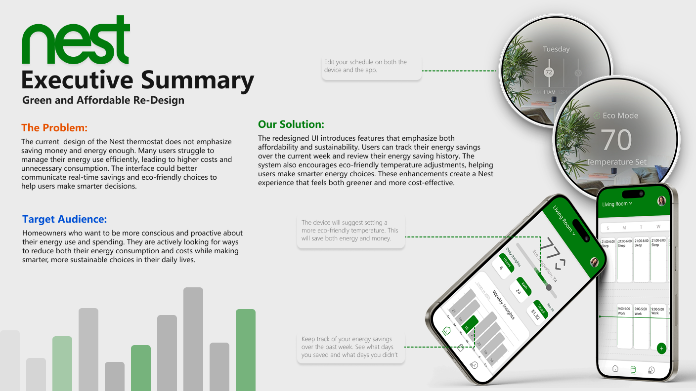
The Nest thermostat's cluttered interface buried the features that matter most — scheduling and energy insight. Over 10 weeks, our seven-person team redesigned both the Nest device UI and its companion app around a single idea: make saving energy and money visible and effortless. As Design Lead, I drove screen design across both form factors and ran moderated usability tests — 12 sessions measuring task time, tap counts, and SUS — whose findings directly shaped the final designs, component libraries, and style guide.
The problem
A cloud of confusion and clustered interfaces was blocking users from the parts of Nest that matter most — including key features like the schedule. The interface didn't communicate real-time savings or eco-friendly choices, so users struggled to manage energy use, leading to higher costs and unnecessary consumption.
Our audience: homeowners who want to be conscious and proactive about their energy use and spending — people looking to cut both consumption and cost without making it a second job.
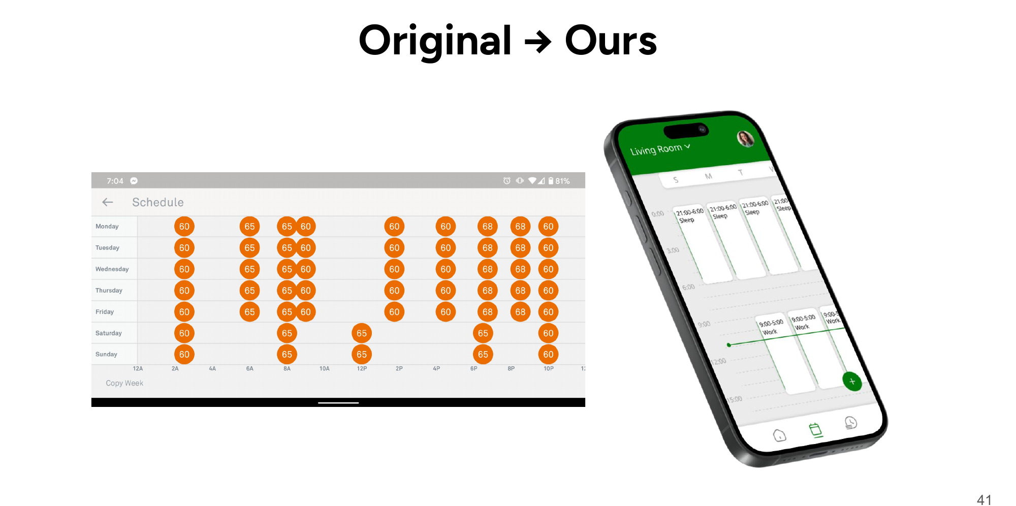
How might we simplify the current Nest interfaces to increase usability and easily communicate ways the user can improve their environmental impact and save money?
Constraints
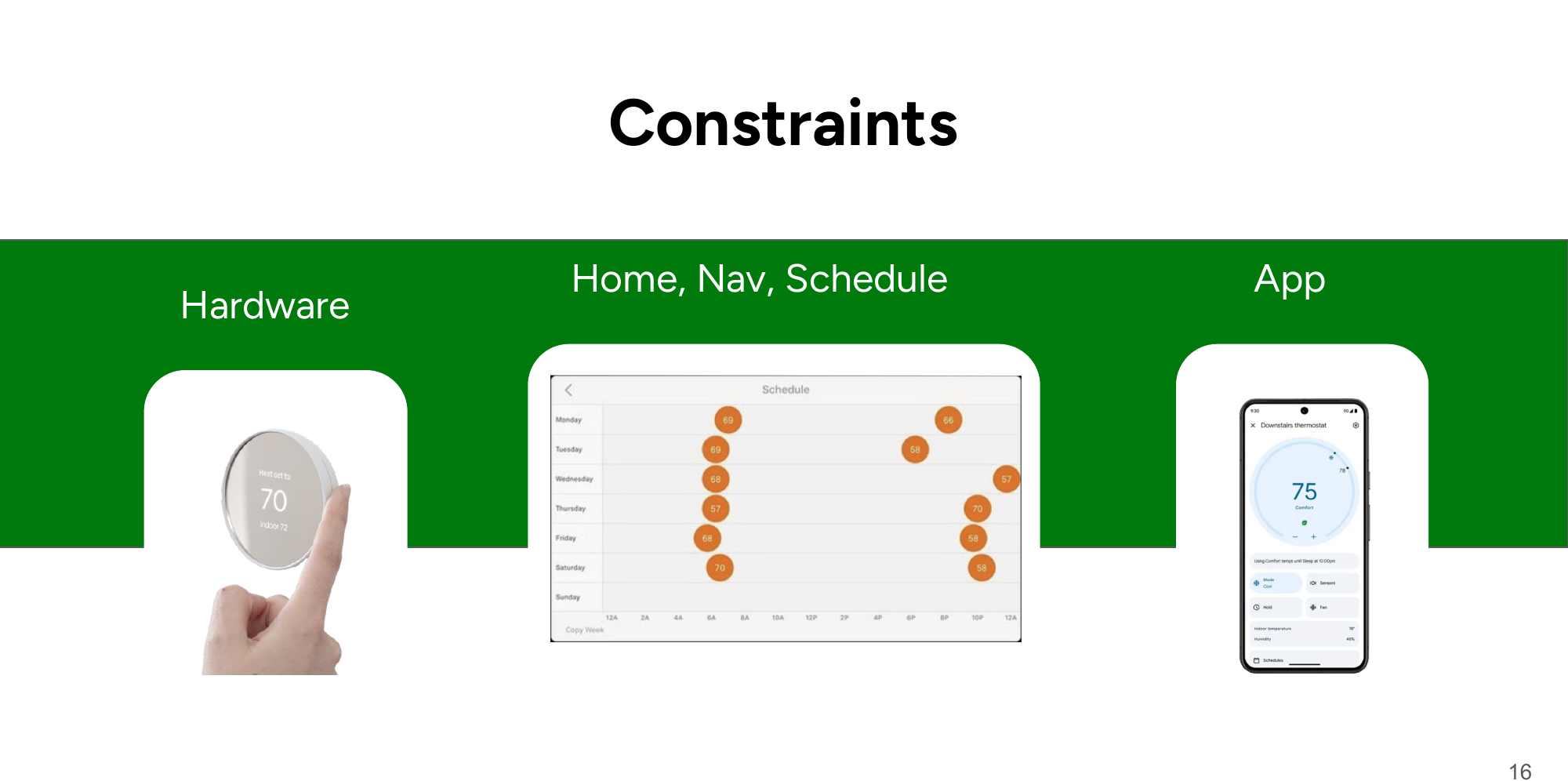
We worked within three fixed boundaries: the existing Nest hardware (round display, dial interaction), the established Home / Nav / Schedule structure, and parity with the companion app. Designing inside real product constraints — rather than a blank canvas — shaped every decision that follows.
Process
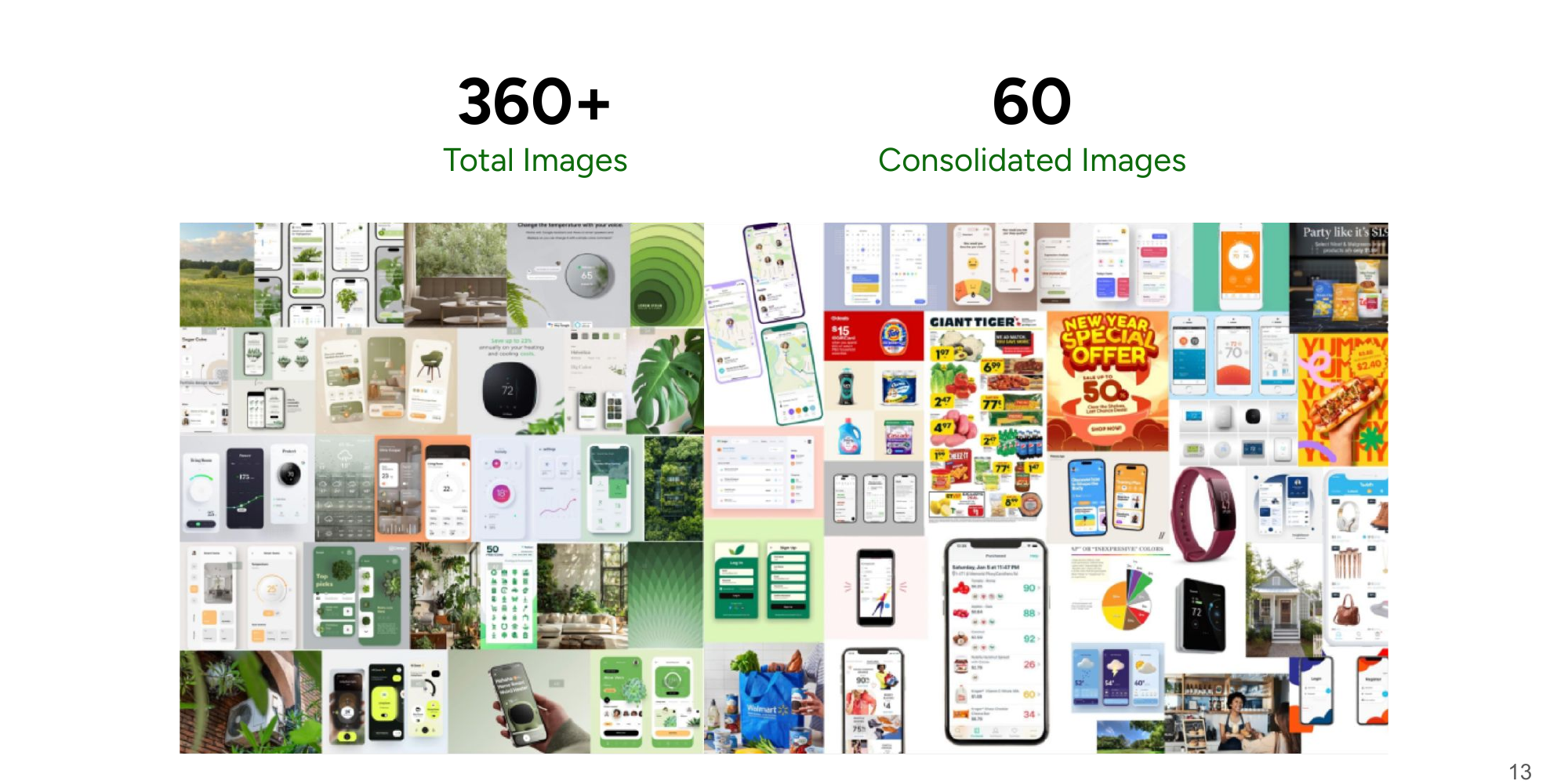
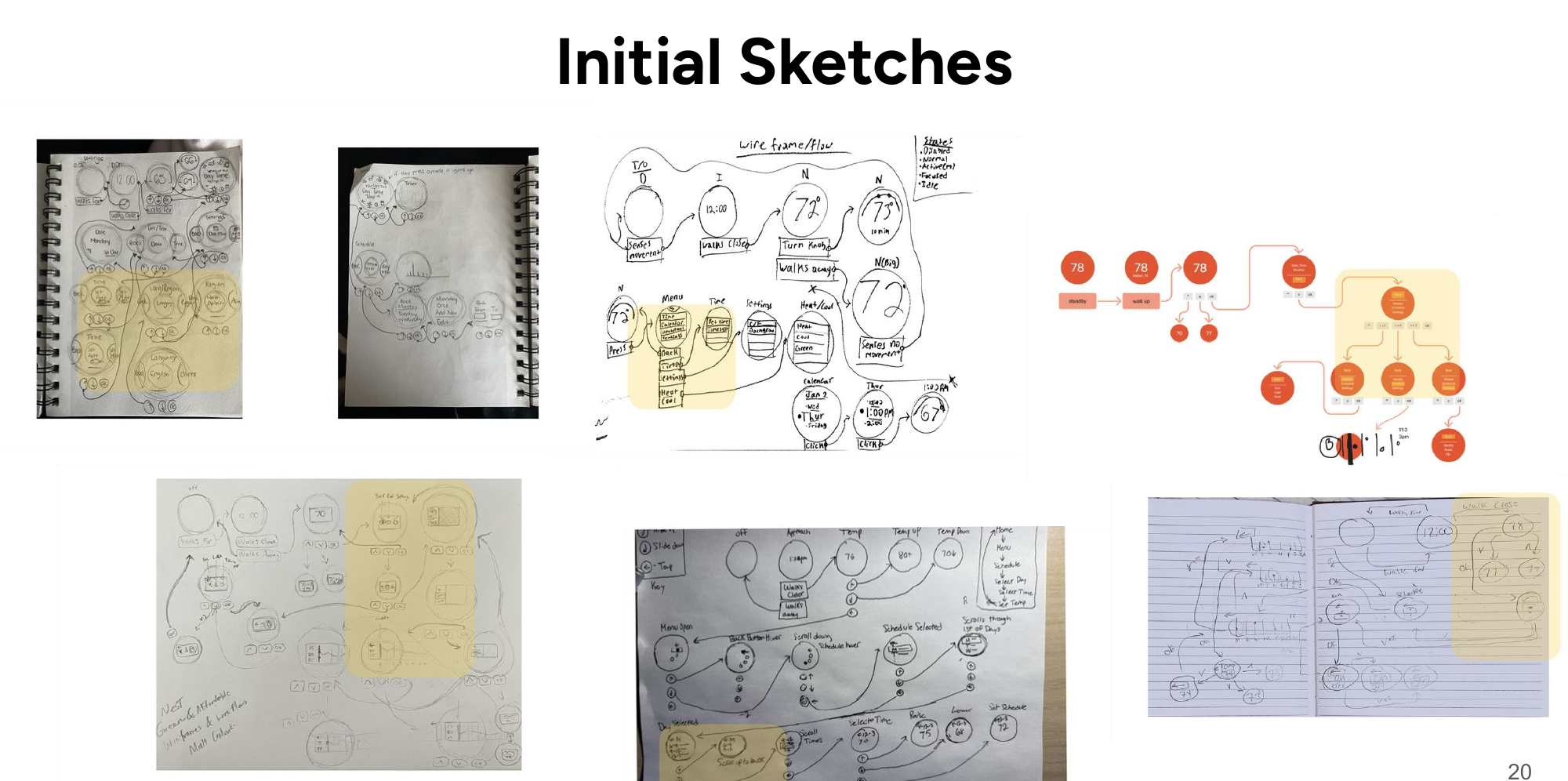
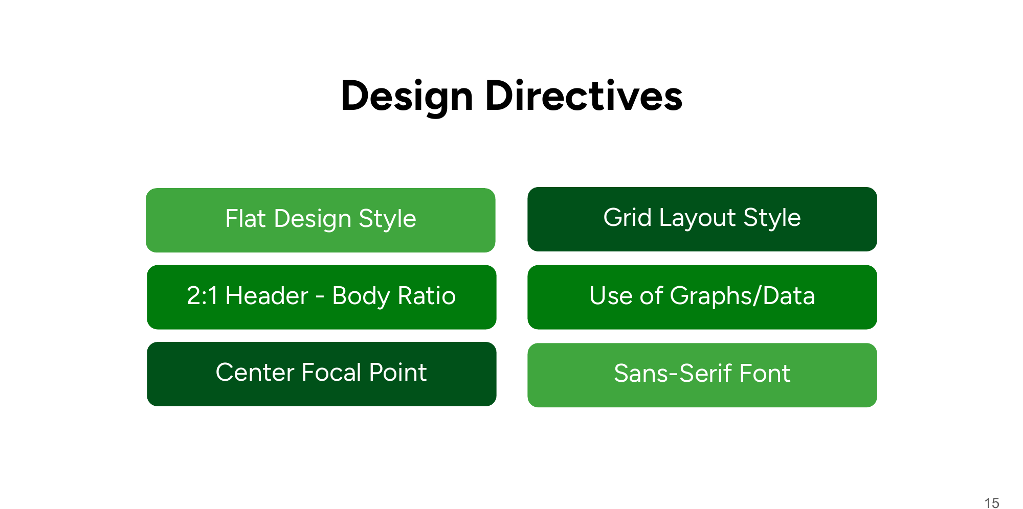
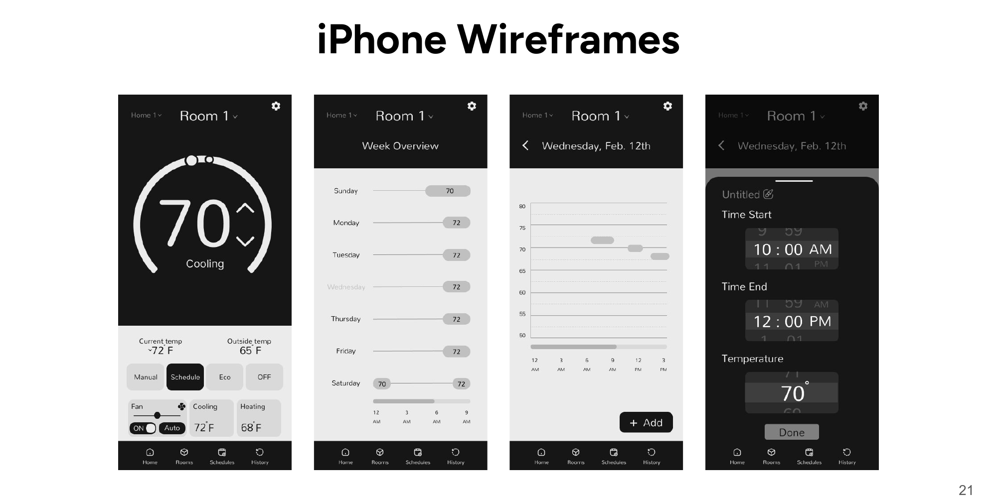
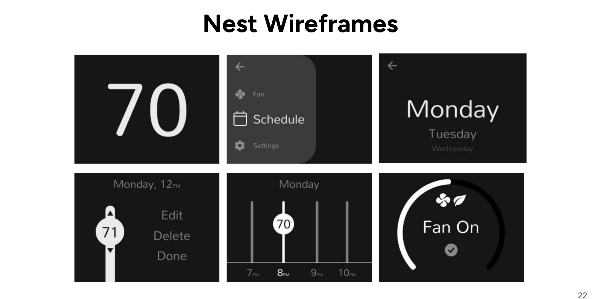
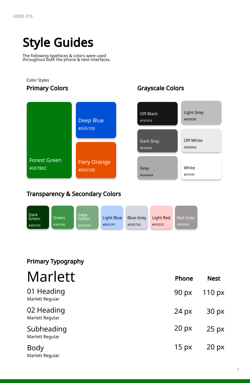
We started wide: 360+ visual references consolidated to 60, then to 5 final directions, which we distilled into design directives — a 2:1 header-to-body ratio, flat design style, grid layouts, sans-serif type, and data made visual. From there, sketches became wireframes for both form factors.
Testing
We ran 12 moderated usability sessions — 7 on the iPhone app prototype, 5 on the Nest device prototype — with four task scenarios each, measuring completion time, tap counts, and System Usability Scale scores.
- App: 73.5% overall SUS
- Device: 68.3% overall SUS
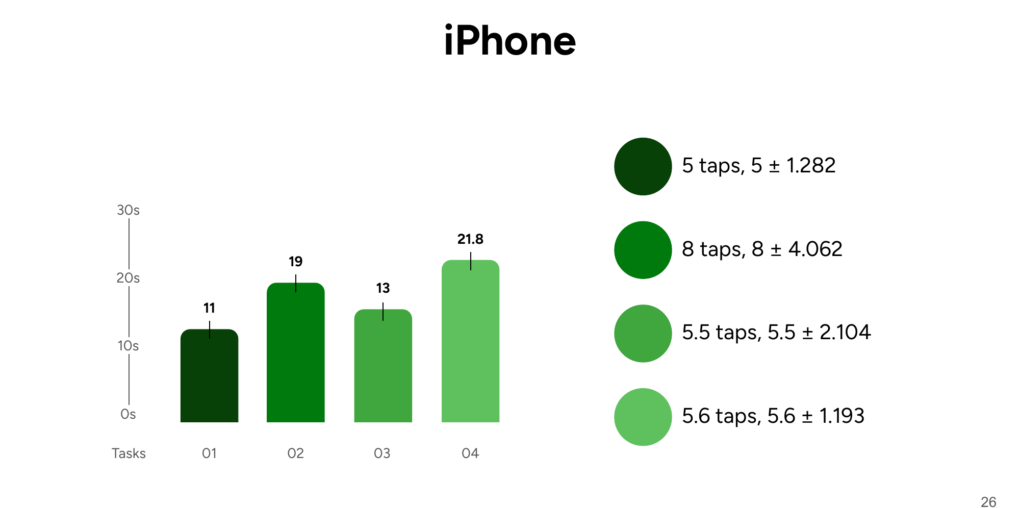
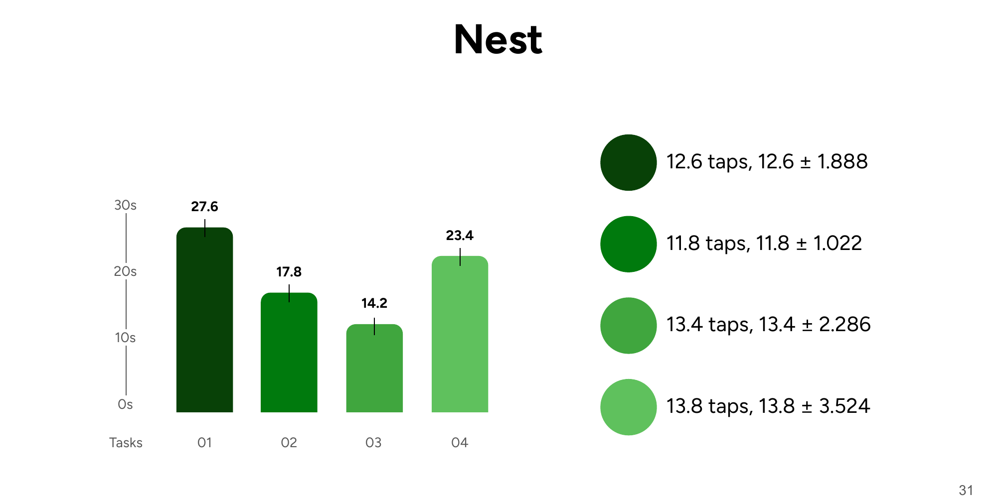
The scores were only the starting point. The value was in what individual sessions showed us.
What testing changed
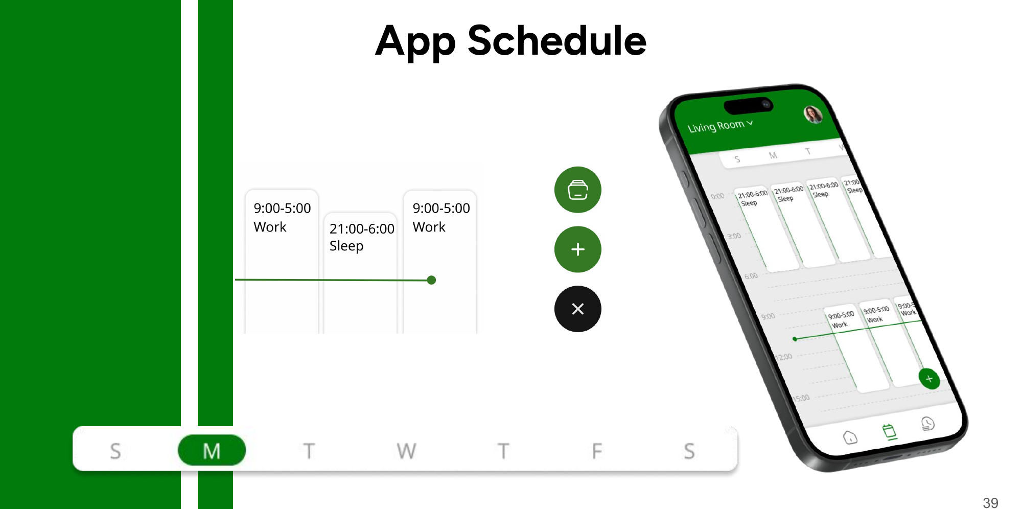
1. The buried preset library. Testers repeatedly failed to find the schedule preset library — it took the longest of any app task (21.8s average) despite needing among the fewest taps (5.6). The problem wasn't efficiency; it was discoverability. We surfaced the library directly on the schedule screen as a persistent action, so presets became a visible feature instead of a hidden one.
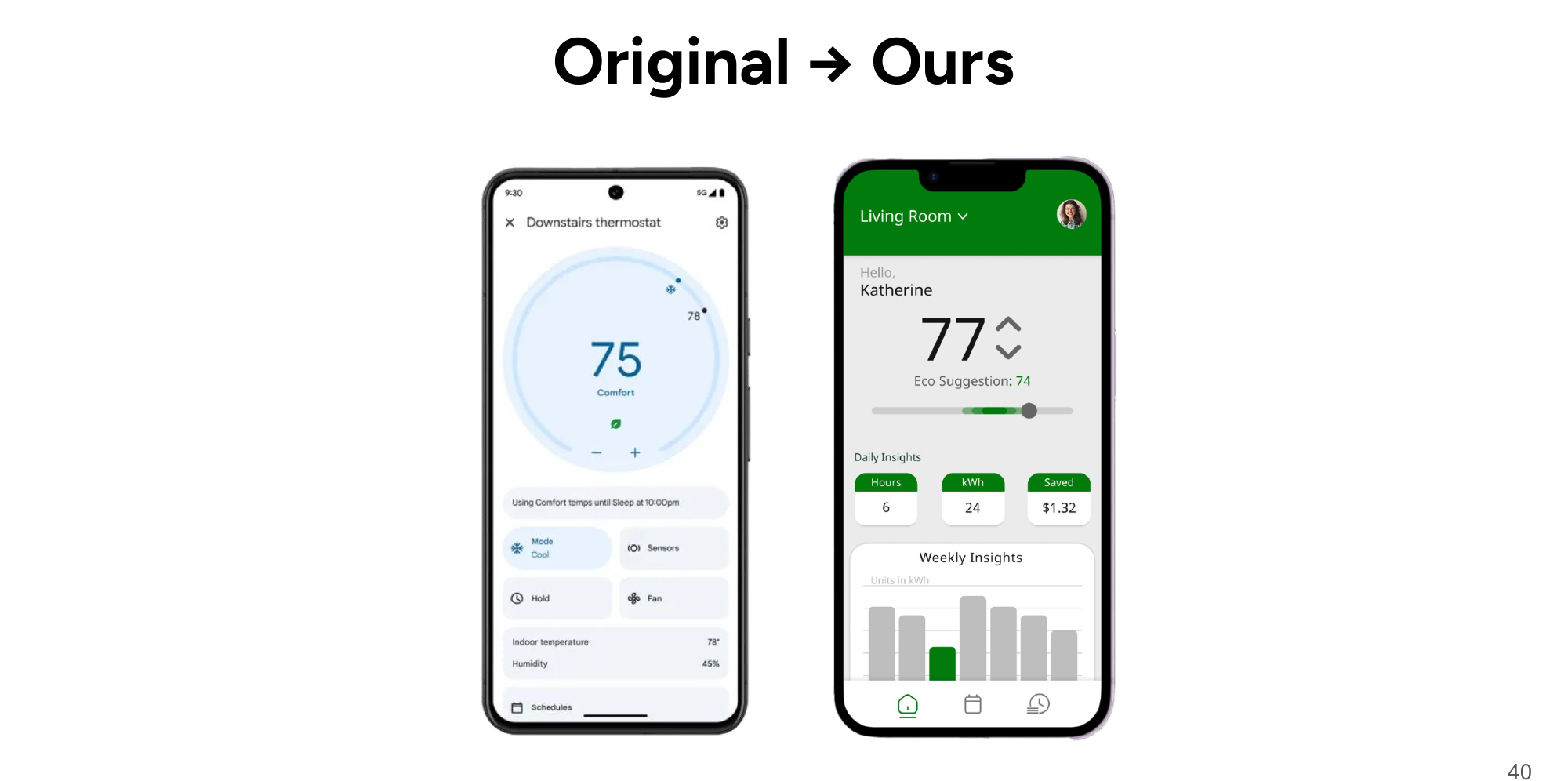
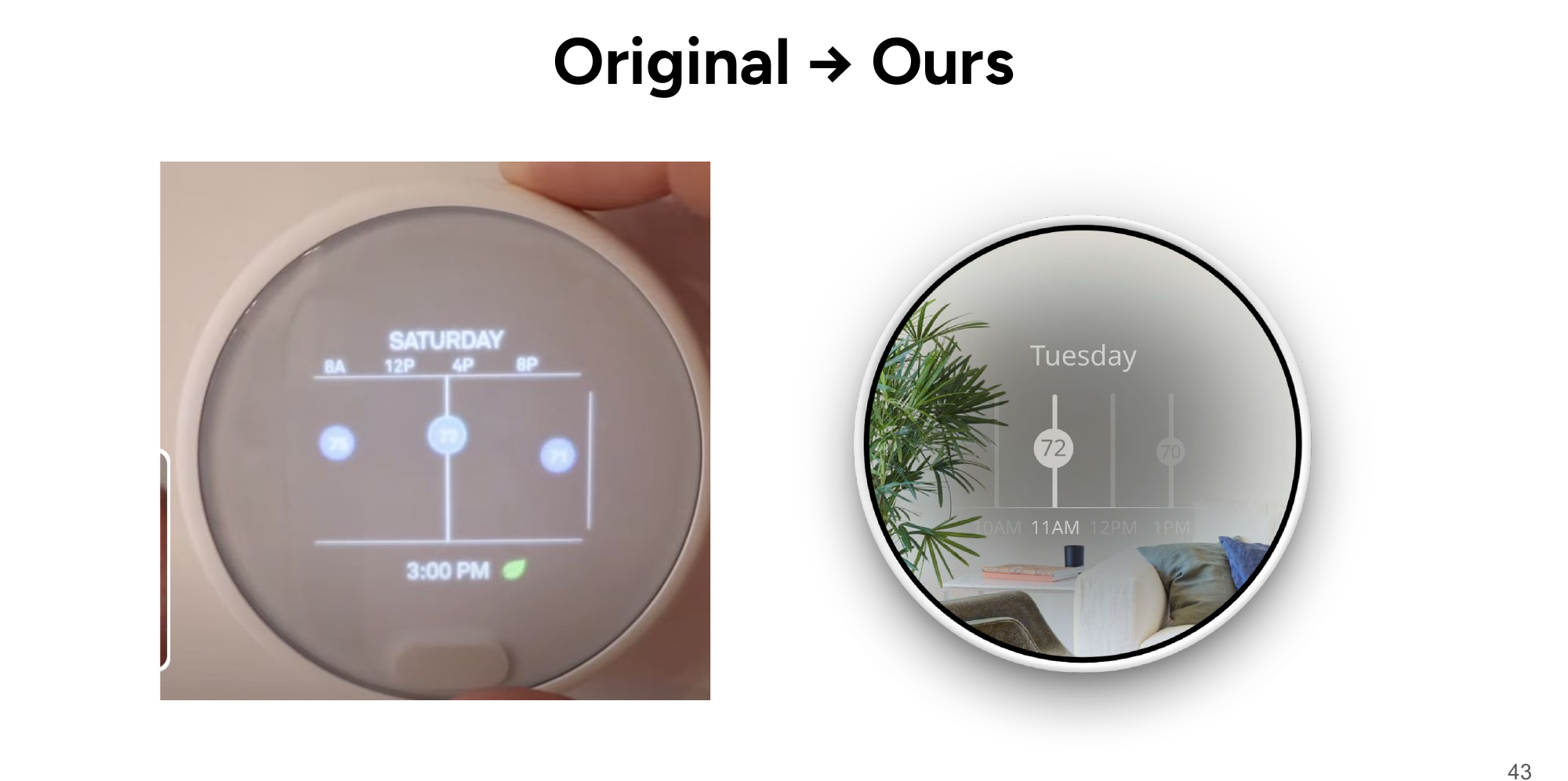
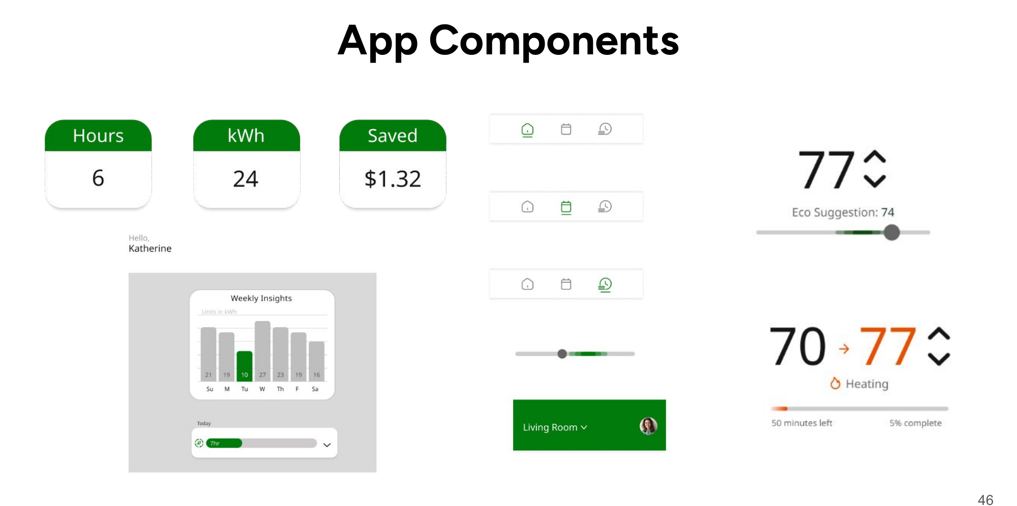
2. An overwhelming home screen. Users hesitated on the app home — too many controls competing at once. We rebuilt the information architecture around one primary decision (current temp and eco suggestion up top) with insights demoted to glanceable cards below. The result is a home screen you can act on in one glance and dig into by choice.
3. The long road to changing the temperature. On the Nest itself, the journey from home screen to editing a scheduled temperature was our worst-tested flow — 27.6 seconds and 12.6 taps on average. We flattened the menu structure and redesigned day navigation so schedule editing sits one deliberate gesture from home instead of buried in nested menus.
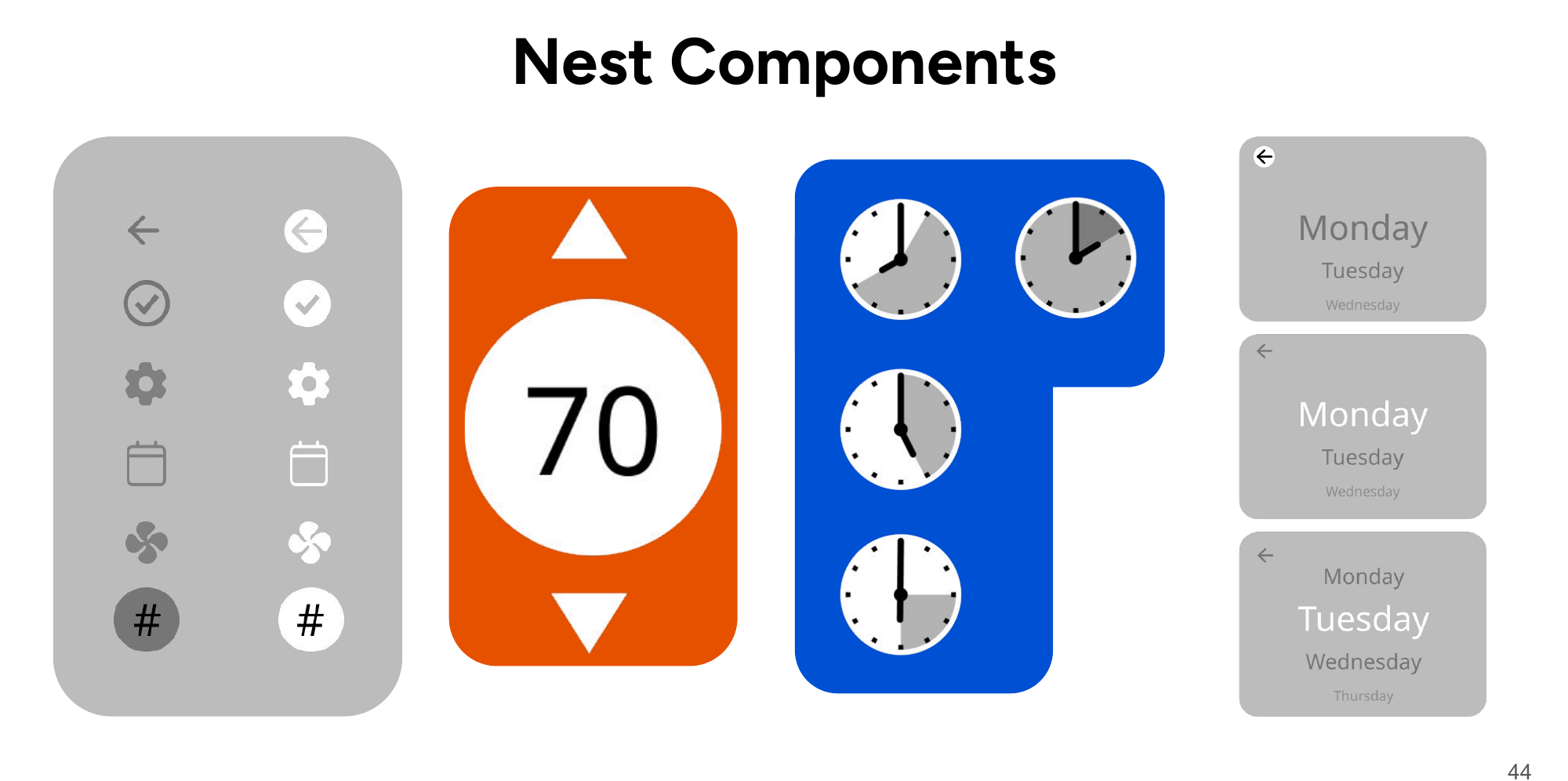
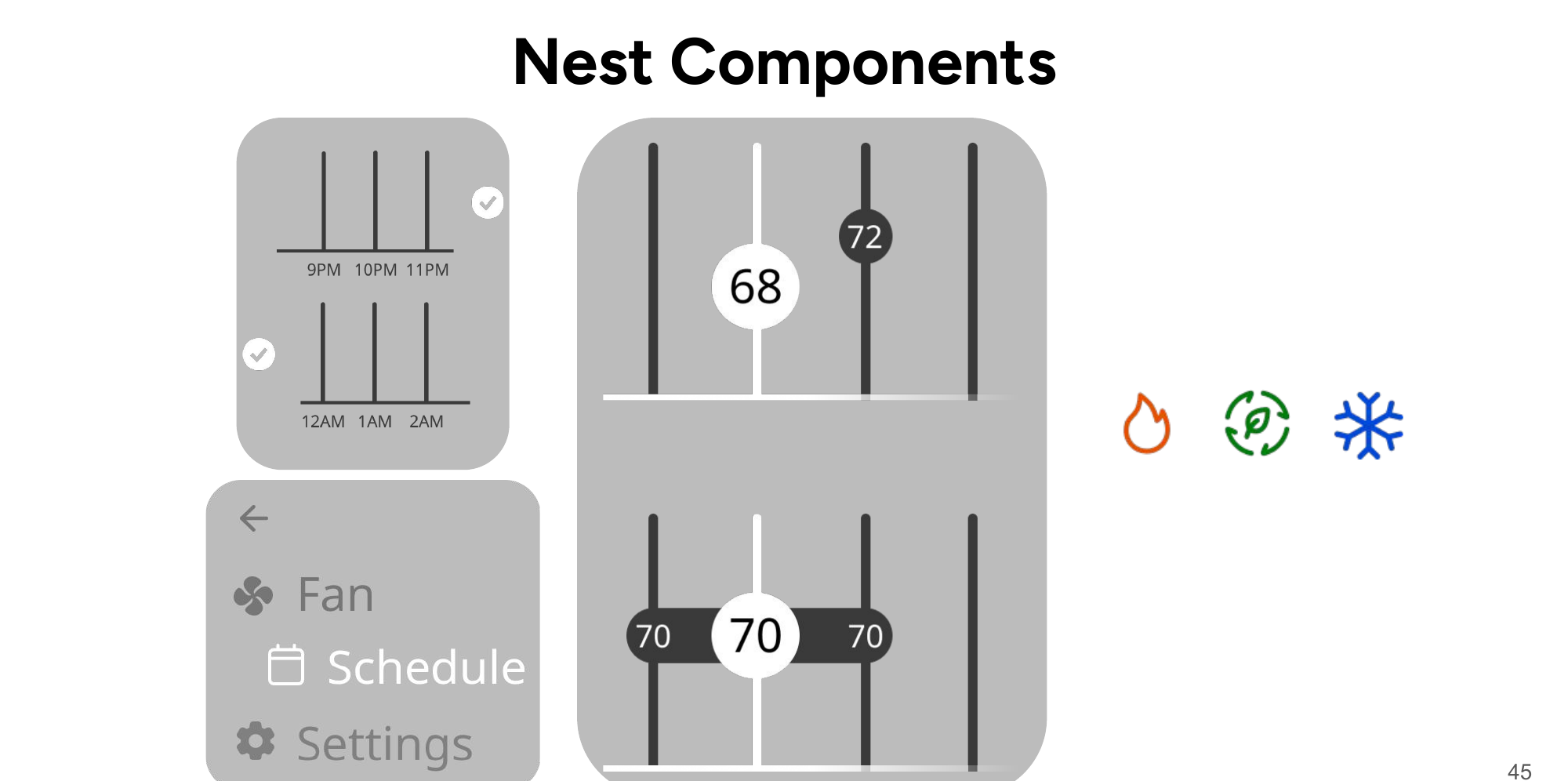
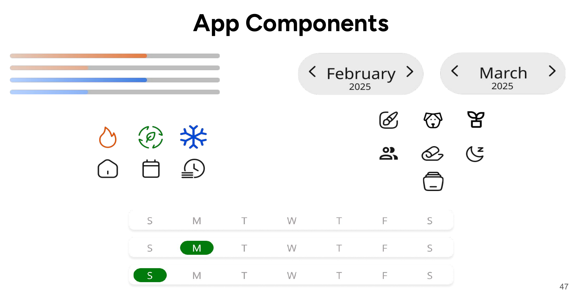
4. "Can I tap this?" Across both interfaces, testers couldn't reliably tell status displays from interactive controls. We built explicit visual states into the component libraries — normal, focused, hovered, active — so every element signals whether it's information or invitation. This finding is why our component libraries exist at the scale they do.
Final designs
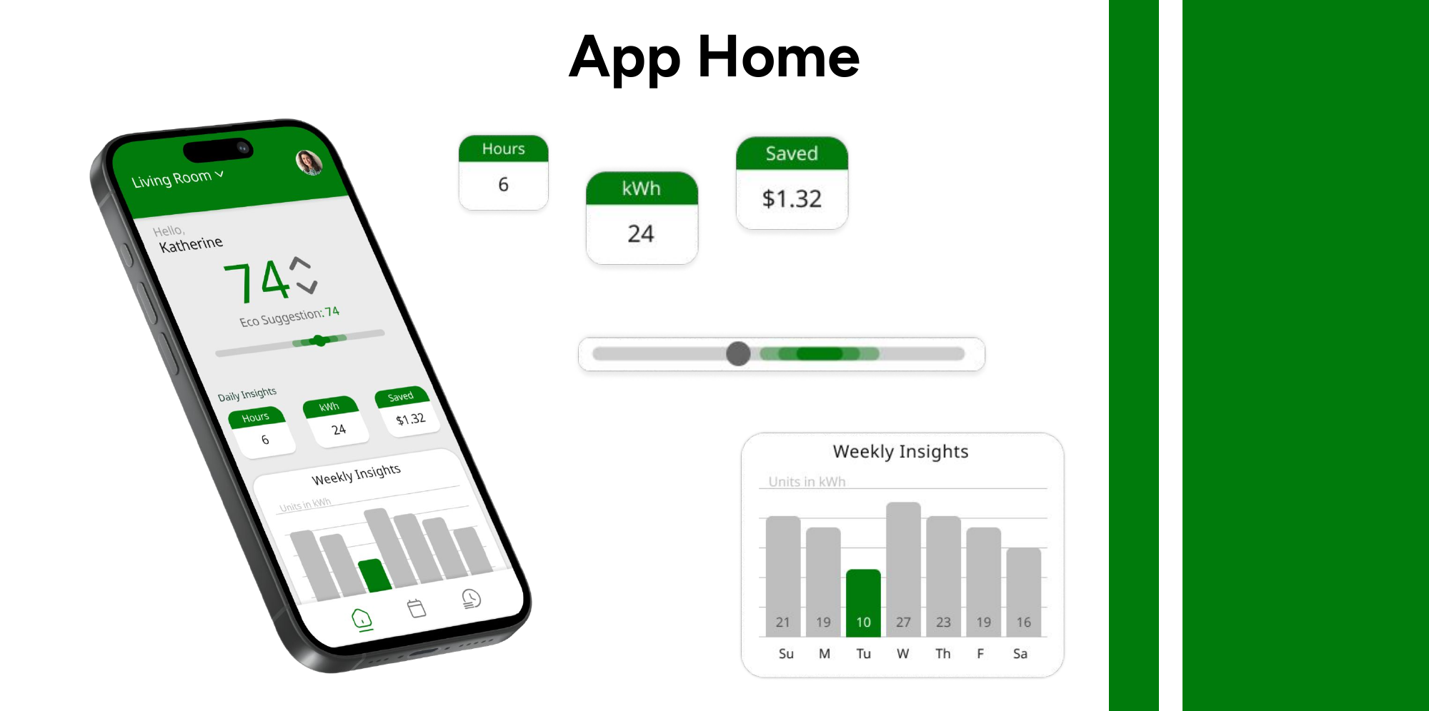
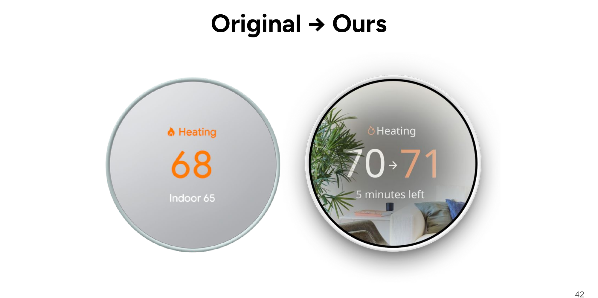
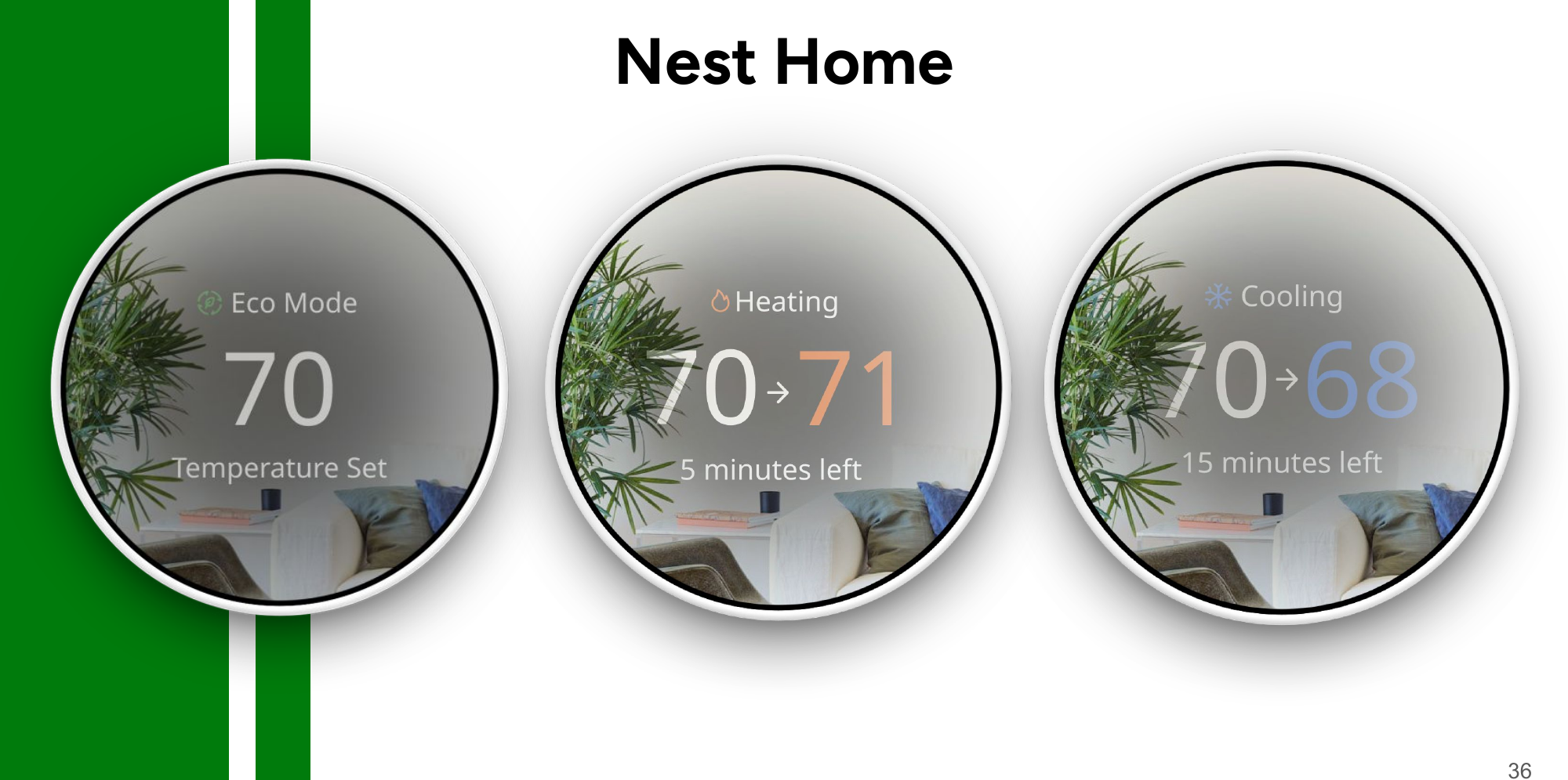
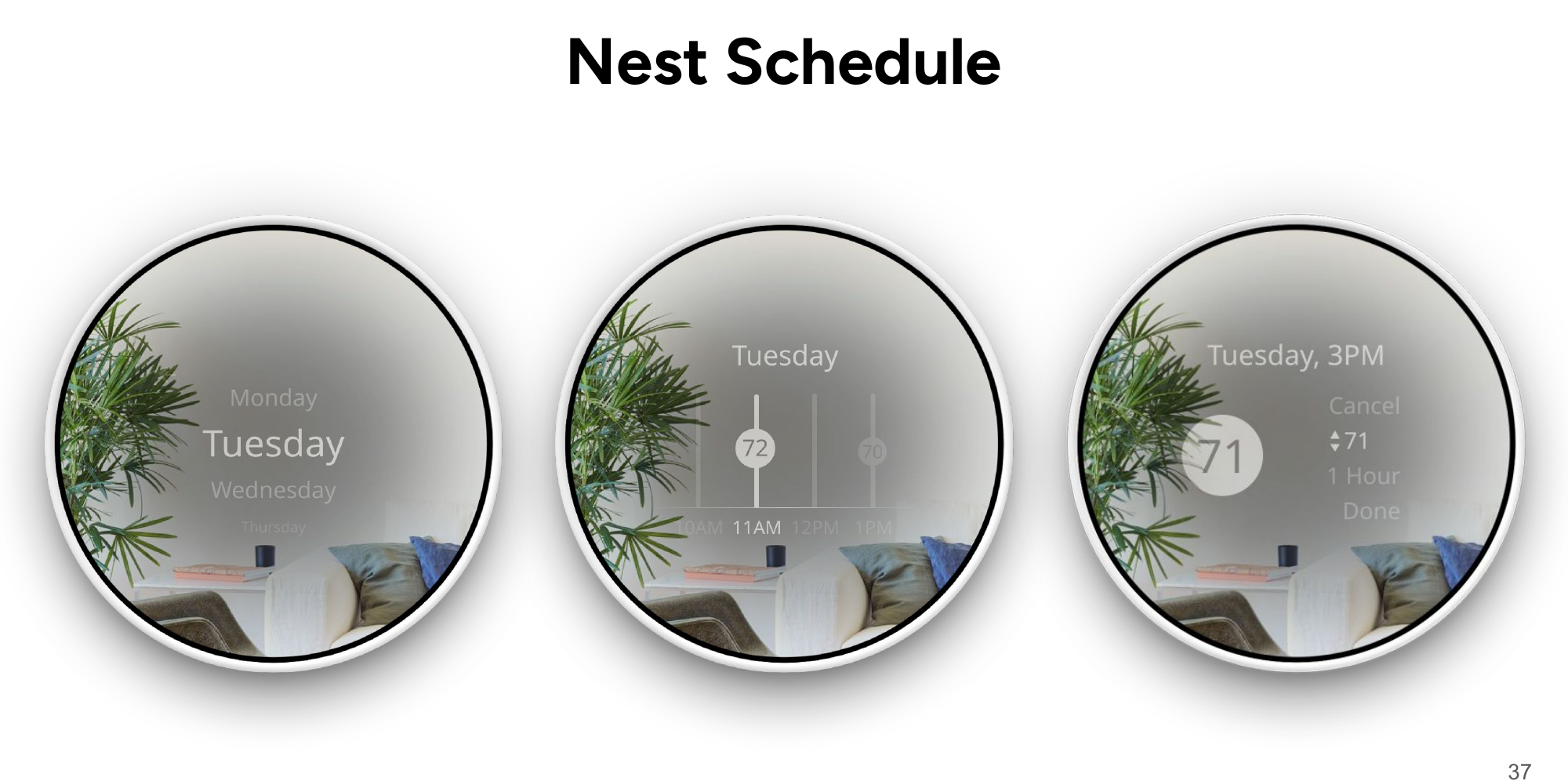
The redesigned system centers energy awareness: eco suggestions on every temperature control, daily insight cards (hours, kWh, dollars saved), weekly insight graphs, and an activity-based scheduling model that matches how people actually live — work, sleep, yoga, plant hour — rather than raw time grids.
Business framing
The redesign requires only minor development cost (defining eco-temperature ranges) and no revenue-model changes, while increasing customer energy savings — improvement that pays for itself in retention and brand value rather than new infrastructure.
My role
As Design Lead on a seven-person team, I was responsible for the design direction holding together across both form factors — the shared language between the Nest device UI and the iPhone app. The work itself was genuinely collaborative: we all contributed across wireframing, prototyping, and testing. My deepest hands-on involvement was in screen design and wireframes for both interfaces and in running usability sessions, where I administered task scenarios and captured the timing, tap-count, and SUS data that drove our redesign decisions.
Reflection
If I ran this project again, I'd close the loop we opened: our SUS scores benchmarked the prototypes, but we didn't retest after the final redesign to measure the lift our changes produced. Building that second round into the schedule is the single change that would make the evidence airtight — and it's the first thing I'd scope in a professional setting.